Year
2025
My Role
UI/UX designer, Graphic deigner
Responsibility
Website design , graphic design
Overview
WEBA is a Martech platform that provides enterprise-level solutions across industries such as finance and insurance. As the product ecosystem expanded, the original website struggled to clearly communicate its value and structure.
This project focused on redesigning the official website to improve clarity, strengthen brand perception, and guide users toward meaningful actions.
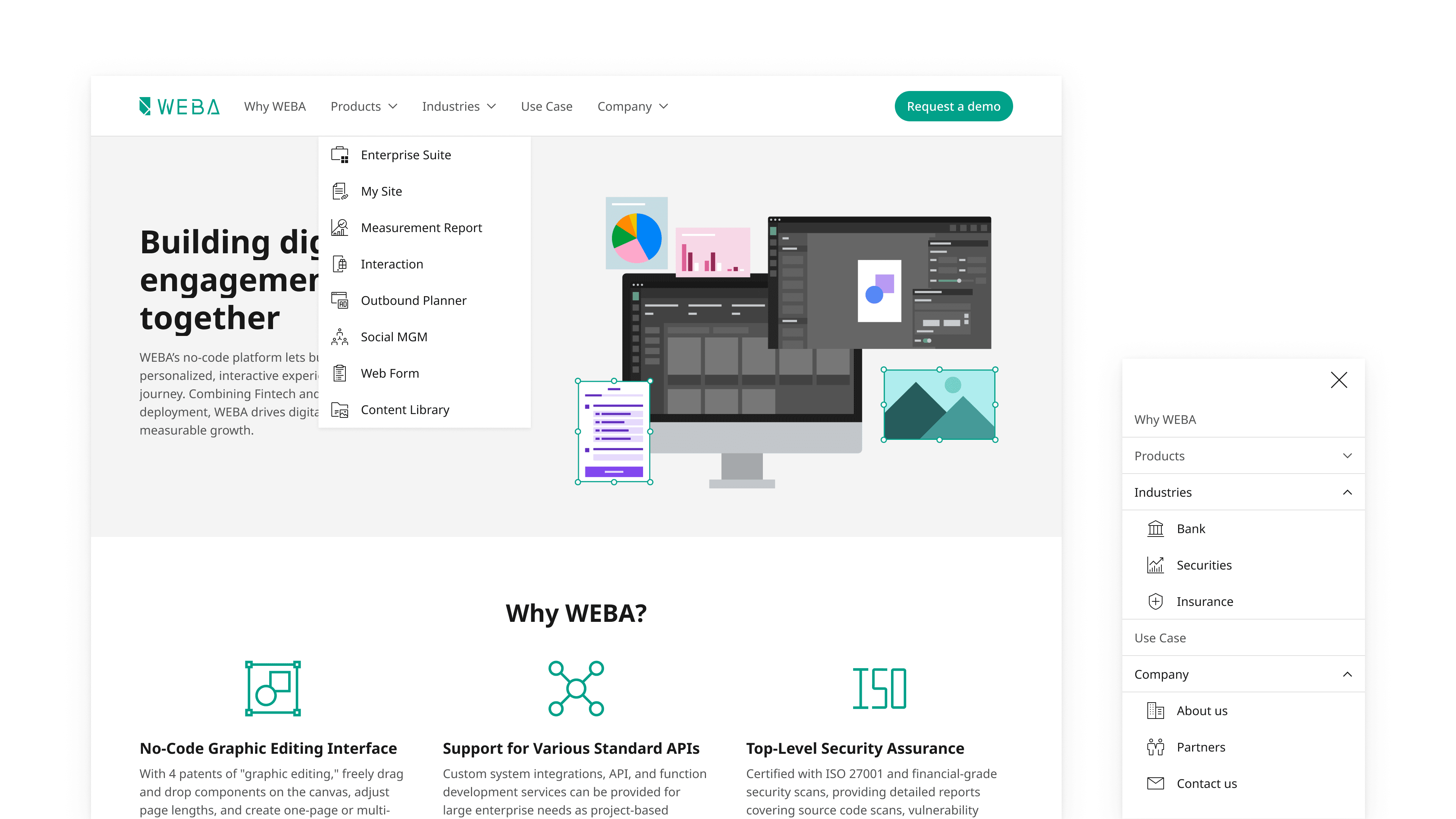
Structuring Navigation for Clarity
The navigation system was redesigned to support a more intuitive exploration experience. By organizing content into Products, Industries, and Use Cases, users can approach the platform from different entry points depending on their intent.
The dropdown and mobile menu were carefully structured to maintain clarity across devices, ensuring that even complex information remains easy to navigate. Custom-designed icons were also introduced to support quick recognition of different categories, adding a visual layer that enhances both usability and consistency.
Together, these elements create a smoother path from exploration to conversion.
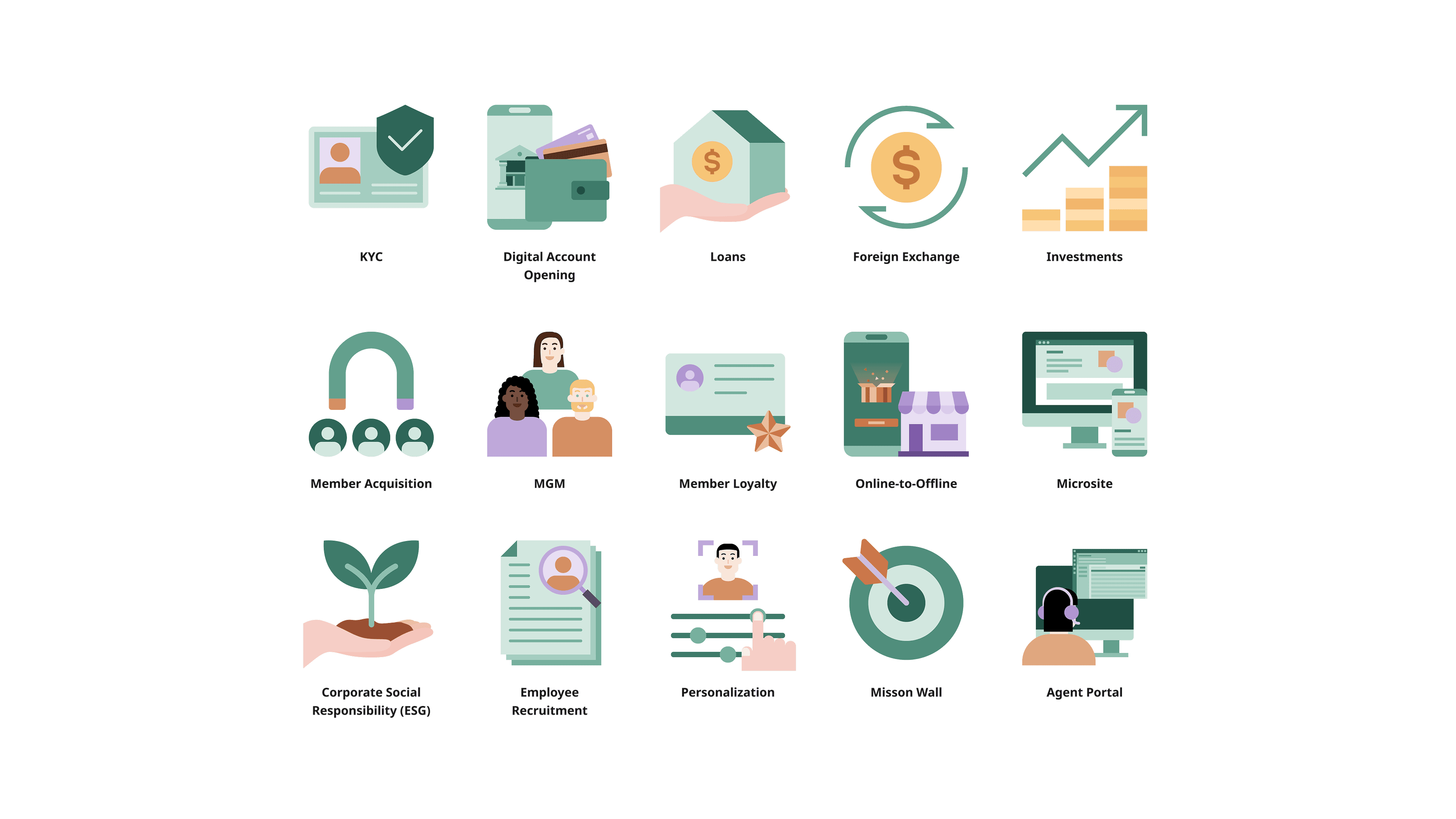
Visualizing Use Cases Through Illustration
To better communicate different use cases, a set of illustrations was designed to visually represent key scenarios across the platform. Each visual corresponds to a specific context, such as onboarding, personalization, or customer engagement, helping users quickly grasp how the product can be applied.
The illustrations were developed based on WEBA’s brand color palette, ensuring visual consistency across the website while reinforcing brand identity. By translating abstract concepts into more tangible visuals, the design improves clarity and makes the overall experience more approachable.